Monday 25 April 2022

Unit 20 Final piece - Finlay Patrick

P1: Describe an existing media campaign


Advertisement 

I decided to look at the "Energy Beats Everything Campaign" for Lucozade energy which uses the biblical story of David and Goliath. 


Target audience

The target audience for Lucozade is for people of all ages who live athletic lives. The Ad uses the phrase “Yours, Theirs, The Universe’s” which implies the target audience is everybody regardless of age, gender or ethnicity.


Approach

This advert is a clear example of above the line advertising. The message of this advert is advert is to drink Lucozade and overcome lives issues and it is simply saying that if you feel more lively you will be able to handle the day to day life easier. After Goliath turns up to David's home ready to get revenge, David takes a few gulps of Lucozade Energy. The advert depicts David gaining the confidence and stamina he needs to venture out with a sling to defeat Goliath.

Key messages and representation

The key message of the advert is to convey the idea that the energy boost from this drink will allow you to overcome any obstacles in your day to day life. This is shown through the slogan “Energy Beasts Everything”. This advertising campaign uses a biblical allusion as a framing device, and shows through visual metaphor, the under prepared performing an incredible feat. In the television and Web adverts this is conveyed through David being woke up by his friend almost as if he angered the colossal philistine in a drunken stupor. Representation refers to how this ad presents the various groups involved. When dealing with the Story of David and Goliath there is potential to offend the people who follow the holy text by making the Jewish character do something uncharacteristic or active go against the religion. With regards to ethnic representation  everybody within the advert is white when the philistines and Hebrews portrayed in the advert would definitely not be white, however the Christians church likes to white wash history.


Relevant legal and ethical issues

Advertising has many legal and ethical issues. The major issue in this advert is the obvious religious representation this advert uses showing through David and Goliath. They had to ensure that they treated the biblical story with respect while tying to promote Lucozade. With regards to religious groups the mere mention of a religion is enough to spark offence, and cause protests towards the advert. 

I then began to go into further detail on various ways Lucozade advertised itself. Lucozade is a sports, energy drink and was introduced to the UK in 1927, which was originally called Glucozade by a pharmacist in Newcastle called William Owen. It was invented to serve as an energy drink (medicine) for sick people, and it had the slogan 'Lucozade Aids Recovery'. They released an advert in 1979, where there was a sick boy watching his friends play outside his bedroom window, but he could not play as he had not had his Lucozade (medicine).


Lucozade energy launched a new £10 million multimedia marketing campaign (in 2021), which aimed to reach 97% of the population by the end on 2021. The campaign reached consumers through a new advert for TV and Video on demand, as well as social media, out-of-home and online video. 'Lucozade, When Your On, Its On' is its new slogan, and the advert has a more cool, upbeat style than the 1979 advert. It has a young male, walking around casually doing the hula hoop as the song 'Here Comes The Hot stepper' plays in the background. When creating this advert, they had a more young, cool, everyday drink approach to it, so that it will target young sporty people.

Target Audience

The target audience for this advert was of all ages who were unwell/sick. The adverts slogan - 'Lucozade Aids Recovery' which implies that the target audience is for everyone who is unwell.

Key Message

The key message of this advert was to let people know that Lucozade was a medicine and that it could help sick people. The advert is promoting a recovery energy drink full of glucose to give sick people.


Approach and Representation

The advert conveys a message to the audience stating that "Lucozade aids recovery". However it is not proven and the slogan is only part of the advert to encourage its audience to buy this energy drink for medical reasons. Although the drink was not proven to have any healing abilities, it will give the drinker more energy to get through there day (aiding someones recovery). The advert represents a solution to someones sickness, even though it may not actually heal them. 

Campaign

This advertising campaign uses certain techniques to produce an effective video.  The use of the catchy slogan and theme tune helps people remind themselves of Lucozade because the song will be stuck in their head 


M1: Evaluate different cross media advertising campaigns for consistency of message


Lucozade Aids Recovery


The fact that the advert never included any celebrities, implies that it can be used for anyone in their day to day life. They are presented as normal/ average people through their clothes and setting. 

As well as the advert, there was also print ads made to help advertise the product, with an image of a Lucozade bottle, with the slogan written through the middle of it.


This helps to imply that Lucozade helps to heal sick people. The slogan that is written across the page, backs this up and influences the viewer to buy this product when they are unwell. 

The use of the simple orange and white colour theme almost makes me want to purchase the product.


Energy Beats Everything


The David and Goliath advert relies on the biblical story to convey the idea that you can overcome great odds by drinking Lucozade. This is fitting as their target audiences are unlikely to understand the biblical story, but will likely understand the easy visual metaphor of an underarmed guy having to fight a giant. 

There was also a Print Ad made of this to help reinforce the idea that 'Energy Beats Everything'.


This helps to imply that the energy you get from drinking Lucozade can help you overcome any problems that come your way. The use of imagery of the man standing on top of a defeated giant helps to back this up as it shows you ca defeat anything or anyone.

 The target audience is made clear to the viewer through the depiction of David a young in shape man. This fits alongside the idea that Lucozade is an energy drink for athletes and sporty people as conveyed by Davids impressive figure. 

The orange colours of the brand have been shown to have an angelic glow, implying that the drink is a sacred artefact or has some holy god given power, when in actual fact, its liquid sugar.


Comparison of 'Energy Beats Everything' and 'Lucozade Aids Recovery'


When it comes to colour scheme in both of the adverts, the orange stands out to me as it consistently shown throughout both of them due to the fact that the colour of Lucozade is orange. Due to the difference in time of when both adverts where made, the David and Goliath advert had many more digital capabilities and therefore was a much more effective and reliable advert. Whereas the 'Lucoazde Aids Recovery' advert gives off false information, has no special effects, and has a poor quality video. In both ads, they present a bottle of the product in the centre of the screen so that it is the focal point and so that the TA knows exactly what to buy. The quality of the bottle itself has also evolved, and now has a more modern and athletic design to it.


M1 - Horror Posters 

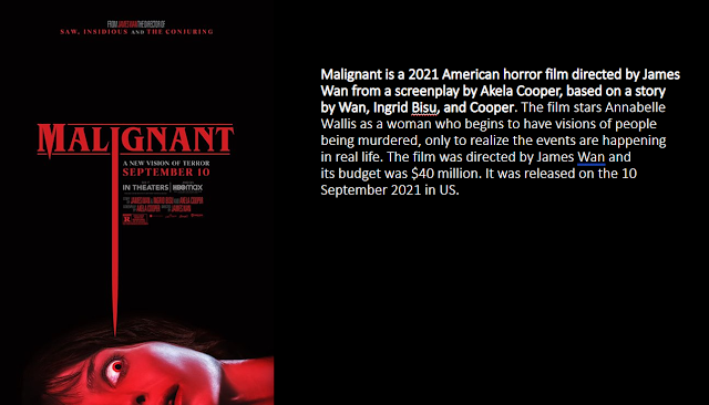
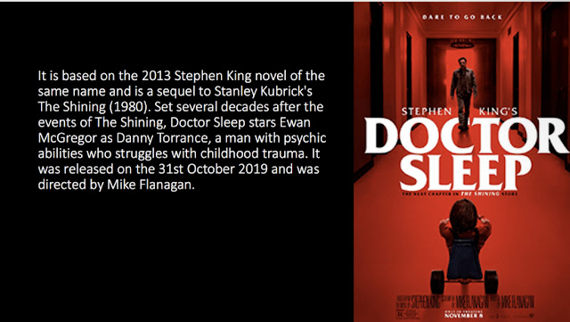
At the beginning of my Unit 20 Advertising campaign I researched 9 Horror posters that interested me (in the design and advertising methods). 

The majority of the posters that i chose contributed towards my final outcome, as i took partial ideas from each one and made my final outcome.


I Then began to pick 5 of the posters I liked the most, purely based on the design, layout and colour scheme of the posters and then drew thumbnails of them. These would then help me later on when I began to create my very own horror poster.


I picked 'The Hallow' as its poster creates a deep sense of mystery as it shows a man exploring a mysterious cave, with what looks like branches and skulls around the edges.


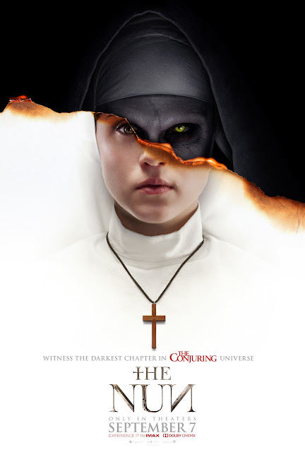
I chose out 'The Nun' as one of my 5 thumbnails because I really liked the way that the image shows a half and half image (good vs bad) and the way that the title 'Nun' is a palindrome is very unique and creative for a horror title.


'Night Train To Terror' really stood out to me as it is an old poster from 1985, but conveys a sense of mystery as there is a bloody knife in the middle of a train track in the middle of knowhere.


'The Conjuring' really stood out to me due to the fact that it has big bold writing at the very top of the poster, and the use of the old abandoned house, the leafless tree and the fog creates a sense of fear.


The poster 'IT ENDS' is really effective as it is very simplistic and simply just shows a zoomed in picture of the main characters face.

I then decided to pick the three posters, I liked the most and created some more in depth research on them.


Poster 1 - The Conjuring

2nd August 2013
Serif font
Filmed in North Carolina, USA

A 2013 supernatural horror film which was inspired by a real life story of the Perron family. They began to claim that they lived among the dead in the 1970s as spirits. 

A true crime version of this could make for a fascinating watch.

The first teaser trailer was released in New York at Comic Con in 2012, kicking off the movies marketing campaign in 2013 where the official trailer was released. 

The first promotional images where released in November 2012.


The movie then began to release posters, billboards and bus livery to further advertise it.

 There where also, Facebook, Instagram and Twitter pages created to be dedicated to the film which posted news and new information of the film.

Above are some of the images that I have taken from 'The Conjurings' Instagram page of newly released posters, trailers and teasers.


Poster 2 - The Nun

                       
7th September 2018
Serif font
Filmed in Romania

It was not based on a true story, although it was inspired by the Warrens cases.

It was advertised on buses (bus livery), Billboards and on YouTube but had to be taken down due to a violation of YouTubes rules, as it had a big jump scare to freak out the viewers. 
It was also advertised on various media platforms, such as Instagram, Twitter and Facebook through posters and trailers.
                         

These are images I took from "The Nun's" Instagram page, where they are promoting their film through trailers/ teasers and promotional posters.

The Hallow

                         
26th June 2015.
Filmed in Ireland.

It is a fantasy story that was rooted in reality and Hardy used real locations and drew from real Irish folklore to set this haunting story in a world recognizable to our own.
It was advertised through posters, adverts and trailers on YouTube.

The dark colours mixed with the fire, help to create a sense of mystery and helps to portray fear to the viewer.

LO2 Be able to plan a cross media advertising campaign to a client brief

P2: Create a plan for a cross media advertising campaign in response to a client brief

Advertising Brief

THE CLIENT:
21st Century Productions Ltd.

ABOUT THE CLIENT:
21st Century Productions Ltd is a medium sized independent film company with an annual turnover of 15 million pounds. 
 They specialise in producing high quality short film productions aimed predominantly at an audience aged between 17-25 years. 
The audience/customer is approximately 70% male and 30% female.
They have achieved a reputation in particular for producing films of the Horror/Thriller genre. It is this
specialism that they wish to develop and promote.
THE BRIEF:
The company want to run an advertising campaign to increase ticket of their latest film release (You name
the film). They want to produce a campaign that uses traditional poster sites at bus stops, motorway
service areas and billboard facilities close to cinema locations.


Synopsis:

I will be creating a short horror film called 'The other Side', with the slogan 'Fear The Unknown', for the '21st Century Productions Ltd. Its purpose will be to frighten, scare and disturb the audience, while at the same time letting them be able to be excited and enjoy the film.


Purpose:

The purpose of this Horror film, is to scare and create a sense of fear to the audience. There will be many different effects/ edits to help create scary and disturbing products.


product/ promotion:

There will be many different products including:

  • Many different posters promoting the campaign 
  • A short Av promotional clip/ reel about the Horror film to help build up excitement it
  • T-shirts so that more and more people will see it throughout the world
  • Bus Livery so that it can be seen around major cities
  • Billboards will catch many peoples eyes in crowded city centers


Inspiration:

'The Nun' was one of my main inspirations for my poster because i really like the simplicity and uniqueness of its posters, the way that it is made of two images of her.

'Last Night In Soho' inspired me to create an image with two different images showing

The title placement and font of  'The Conjuring', has really inspired to create me a similar one. The advert will be flashing images of the monster I design chasing people, with screams, growls, and intense dramatic music in the background. 

These are also various posters that inspired me when I began to create my posters.

Setting:

The images will be set in a scary/ gloomy/ dark setting,  with a half and half image of a monster, and a blacked out edge.

The colour scheme will be dark gloomy colours, with the occasional bits of red in it to signify blood, and dark blue to portray a different version of the monster.


Font:

There will be a drippy/ skinny serif font for the title so that i can then use the liquefy tool to create a blood like font.

Target Audience:

MY target audience will be 18+ year old males as the majority of horror film viewers are this age.

Imagery:

 I will use an image of the a monster, in one colour and then i will a split down the middle of the image and add a scary facial expression of the same monster on the other side in a different colour. The posters etc will be in a black, blue, white and red colour scheme.


The main character will be in the centre, and it will be a mix of two different images of him put together. These will be put up in DVD shops, on buses and on billboards in populated areas. The reason for choosing these locations is so that I can advertise the film in many different places, where all different types of people will see it. 


Media products and software I will be using to create my Outcomes:

 I will be creating Audio Visuals (due to the fact that 70% of the target audience are mainly influenced by this), Posters (A3 or A4), bus livery, bus stops, Twitter, Instagram and Facebook pages (1200x628 pixels) and billboards (6.096m x 3.048m) to help promote the film.
 The idea behind this advertisement is to create interest in my product, and I hope that I can gain a minor following through teaser ad’s before the film airs. This will be done by revealing as little about the film as possible in the advertising but making sure that everybody will know when it will be arriving.
 I will do this by creating thumbnail sketches, to plan my design and I will take it into Photoshop, In Design and other online editing websites to help give it a professional look. 
The posters will be put up in DVD shops, on buses and on billboards in populated areas. The reason for choosing these locations is so that I can advertise the film in many different places, where all different types of people will see it. 


P3: Create a plan for a cross media advertising campaign in response to a client brief

Pre-Production:

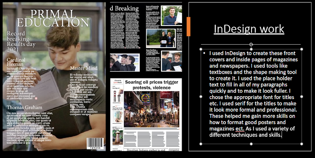
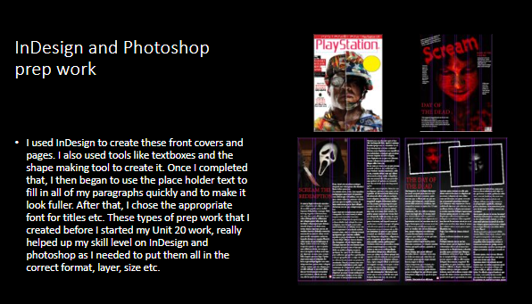
As part of my pre-production, I went into Photoshop and In Design and used played around with a variety of different techniques to help improve my skills.

In Photoshop I had to use a special tool called FX to change the design, shape, colour and fonts of our text. This is just a practice of it as I had only just learned how to do it.


Typography:

Colour Pallet:


I chose to keep to the dark red, blue and black tones to keep my horror posters, as they create a sense of fear. However I used white to highlight  different areas of my poster.


Different websites and apps I used:

These are some of the main websites I used to create my poster, and to help picture them used in real life situations, in places such as busy city centres and public transport.


My Thumbnail sketches


When I began to come up with ideas for my posters etc. I took various different images of graveyards, famous buildings and images of myself and other people using snapchat filters. These helped me to come up with a variety of different ideas and outcomes for my final design. I made sure that the majority of the images where completely different from the rest, so that when it come to my designing my final outcome, I had more of a variety of options that I could create.


Personal Images:

After that, I started to narrow it down and pick a few of the images to start and create different designs and images. I chose the scariest and most intriguing images that I had taken. I used different filters on Photoshop, and played around with the different tools, to see what worked.

Favourite images:


When creating poster designs, I didn't want to limit myself to just one style, so I decided to pick a few of them and do some trial and error to see what worked best. Once I played around with a variety of different filters and tools, I quickly decided that a darker colour theme would best suit my horror theme as it gave a more scary/ creepy vibe to it as you can see below.


M2: Justify the choice of planned components by targeted media sector

Layout: I have decided to place the image of my monster in the very centre of the page. The monster is arguably more important that the title, as it is what will draw the viewers attention to the poster. I will then place the title at the very top of the page, right above the monsters head.

Colour  scheme: I have decided upon blues, reds and blacks with an outline of white. This creates a stark level of contrast whilst still being visually appealing, something that was demonstrated to me poorly by my research into already established ad campaigns. The use of the reds, help to create a sense of gore as it can be seen as a reference to blood. The blues create a cold feeling whilst making it look like it has a sickly blue digital glow. 

Imagery: The monster will be in the very centre of the poster, and will be split down the middle. On one side of the image, there will be the monster in a blue, black and white variant, and on the other side it will be a simple black and white variant of it. There will also be a shadow of a hand holding a knife above his head and around the edges of the poster, there will be a black shadow.

Font: The font is often overlooked by many people,  but your brain does process font and typeface more so than the words the font is being used to write. With the knowledge in mind that font can make or break a product I chose a  a drippy/ skinny serif font for the title so that i can then use the liquefy tool to create a blood like font. I will copy and paste two of the same title and overlap them in two different shades of either red or blue.

Tone: I have touched upon this before I wanted to create an unsettling look with a distorted picture of the protagonist, making it unable to be read what exactly he is thinking.


LO3 Be able to produce the planned media components

P4: Create the media components to be used in the planned campaign

Production process:

Before I began to come up with my final outcome, I decided to create a few poster plans all from images of my own, or from google, which I have modified. I began by picking out my favourite images, and began to test out different filters on all them to see what I liked.


For this poster, I chose one of my personal images to create this image, and put it into Photoshop and put a filter over it. The way the filter gives this poster a sort of old horror film style look, really intrigued me as it makes it look more dramatic and horrifying.


For this poster, I got one of my friends to lie on the floor to imply that there is a dead body there. The use of the plastic type filter over it, helped reinforce the idea of the title of it being "The Other Side". When creating the title for this poster, I chose a serif font, so that it looked like more of a classic film, and then I copy and pasted it and used the magic wand tool to change the colour of one of them. I then slightly adjusted the front one so that it had a kind of 3D style looked to it, which I think draws the reader in more.


I took an image of the medusa styled woman from google, and used the stamp tool to blend the scales into her face and darkened the edges of the snakes more. When designing the title, I chose a skinny/ slanted font and used the liquefy tool to create the ridged effect, which personally, I believe fits in with the whole concepts of snakes.


As I created this poster, I decided to keep the colour scheme across the image and the title the same, as I faded the title from dark to light blue. Also, the use of the skeleton "inside" of the human head really stood out to me as it is a reference to the dead and the living.


For this poster, I modified one of my other designs, and inverted the colours, so that it was more bright than dark. After viewing both of the posters, I decided that the darker one fitted in more with the assignment brief as it looked like more of a horror poster.

After various different designs and outcomes, I finally chose an image that worked best for me as it suited the style and theme I wanted.


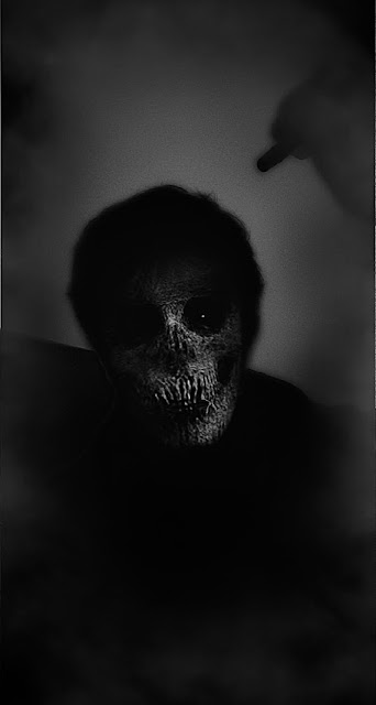
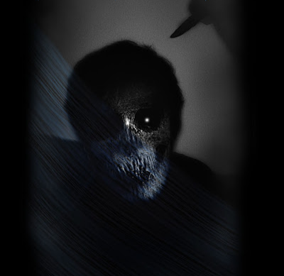
Out of all of the images that I had taken, this one really stood out to me, so I decided to take it into Photoshop to edit it more, and to draw up thumbnail sketches of what I want my final outcome to be like. I started off by adding another layer of the same image onto it, and changed it from a black and white image, to a blue one.


Here are a couple of thumbnail sketches that I drew up, so that I could visualize what I wanted the poster to look like, without putting too much time and effort into it. on both designs, I kept the image in the same place, but I adjusted where all of the writing was going to be so I could see what worked best.


 Then I used a rubber preset and began to slightly erase some of the blue image, so that the original white and black one could come through. After that, I selected parts of the lightest areas and made them even brighter, so that they would be more vibrant and stand out more. When I took the image, I decided to hold a pen so that when I took it onto photoshop, I could use the liquify tool, and create a knife like structure. Once I had done all of this, I wanted to create a faded black edge around the image, just to make it a little bit more dark and mysterious.


This was the final design, that I decided to go with as I really liked the design of it, and the way it shows two separate images in one. The advert I will be creating, will consist of flashing black and white lights, with images of this monster (Chris Rock - main character) chasing someone, while screams and dramatic music play in the background.

 I'm hoping that with this advert, it will help create a dramatic atmosphere toward the viewer, so that it will entice them into wanting to watch the whole film. I then had to decide what font styles, colours, placements and sizes for my posters I thought fitted in with the image and the title. After considering all this, I decided to trial the same colours from inside the design e.g. blues and whites, but I also decided to use a blood red as it gives a sense of death and gore.

Final Poster Designs:


When creating the title on this design, I decided to go for a serif font and I used the liquify tool to create dagger like letters. I duplicated the title two times and put it slightly behind the first layer in a darker colour. When adding the slogan in, I put it just underneath the title in a smaller and more crooked font.


I decided to copy the same format/ layout of the previous poster, but to change the fonts colour scheme to various shaded of blue, instead of white and grey.


After creating the first two posters, I decided that I wanted to add a blood red colour into it, to create a sense of death. I created this by going onto a website called "postermywall" and changed the font, layout and colour scheme.

Advertising:

So that I was able to see what my posters/ billboards would look like in the real world, I used a website called "place it.net" which enabled me to place my posters on real life billboards and screens to see how effective it is. I chose to import them into all different settings, just to get a feel of how it would look at each different place.

Instagram page:


City Centre Billboard:


T-shirt:


Bus Stop:


shopping centre:


These give me a rough idea on how unique, and eye catching my designs will look. I have also created a couple second clip of how it would look on an audio visual screen.


M3: Explain how the created media components comply with the codes and conventions of the media sectors: c

compare my work to other posters#
say whether it looks real etc

The purpose of me using code and conventions on my poster, was that I want it to be eye catching and captivating to the  target audience. There must be focal picture that will draw the target audience's eye into the poster. My poster was mainly based on the same style of image that was used for 'The Nun'. After looking at 'The Nun' it inspired me to create the focal point of my poster two different faces joined together.


This will attract certain audiences as it is not only
intriguing, but it is implying that there is more than one evil. Another focal point of my poster is the bold writing, which is not only blue in one poster, but red in another, which is a reference to blood and gore. my movie poster, does not show an age rating, however, any frightening or revealing images, will not be shown in public areas where children can see it. 
My movie poster shows an 18 rating for its violence and gory detail. This fits the BBFC which is the British Board Of Classification who acts as the body over film and entertainment for England orientated cinemas and releases.

After speaking to my peers and tutors, we finally decided on what looks like a suitable, yet frightening final outcomes (which I believe looks like a real horror poster).

D1

Legal and ethical issues:


Legal and ethical issues play a massive part in the media industry. There are so many rules which have to be followed precisely, otherwise there can be major consequences. 

The BBFC (which stands for British board of classification) classifies films and DVDs and is a company that regulates media products into putting it into age classification to ensure that the content is suitable for that target audience age. Films and TV shows are regulated into age restrictions on DVDs and online streaming services. This system protects against younger consumers watching content that may not be suitable for them. My unit 20 advertising campaign relates to the BBFC regulation because we are advertising our new film project by 21st century productions. We would have to ensure all content and advertising meets regulation guidelines and is suitable to advertise to that age of audience. My advertising campaign will abide by the codes and conventions of the BBFC body so our advertising film poster can be approved to be released. I will present drafts of the poster to a group of executives from BBFC so that they can go over all the required attributes, to ensure that i am able to release it.

One of the rules/ regulations is that nothing can be copyrighted. When checking for things that can be copyrighted, I need to make sure that I have my own original music, and or an artists music, but they have to sign a contract allowing me access to use it for my film. If I do not get permission from the artist, then I may be sued and it could result in some huge legal issues.

 To further extend on the copyrighting issues, I need to ensure that everything in the film is original. This will include, original ideas, images, photographs and videos that I will be taking. If there are any facts that I will be including in my film, I need to make sure that they are 100% correct and that there is not any false information being spread. I need to make sure to document all actions/ processes that I do so that any false accusations against me can be shut down as quickly and efficiently as possible. 
When creating comedy sections of the film, that may target/ hint to a specific person in the real world, I need to ensure that it will not offend or hurt the person that I am referring to. Throughout the duration of the film,  I need to ensure that their are no offensive phrases/ quotes used to slander a specific group of people because in this day in age even minor things can hurt various social groups.
I will need to endure that the film has the appropriate legal/ age rating in comparison to the content that is in it. Make sure that there are no harmful/ deeply disturbing scenes that could scar certain people.

The 'Advertising Standards Authority' (ASA)is the UK's independent advertising regulator. They make sure adverts across the UK media stick to the advertising rules. The Committee of Advertising Practice is the sister organisation of the ASA and is responsible for writing the advertising codes. 
The advertising codes: 

  • Advertising is legal, decent, honest and truthful
  • Ads are prepared with a due sense of social responsibility.
  • Ads conform to the principles of fair competition.
  • Ads don't impair public confidence in advertising


1 comment:

  1. Hi Finlay, extend on your annotation. Greater depth.
    Discuss imagery used and why, colour schemes, font styles, colour etc

    ReplyDelete

Culture Campaign