LO2 Be able to plan a cross media advertising campaign to a client brief
P2: Create a plan for a cross media advertising campaign in response to a client brief
Advertising Brief
THE CLIENT:
21st Century Productions Ltd.
ABOUT THE CLIENT:
21st Century Productions Ltd is a medium sized independent film company with an annual turnover of 15 million pounds.
They specialise in producing high quality short film productions aimed predominantly at an audience aged between 17-25 years.
The audience/customer is approximately 70% male and 30% female.
They have achieved a reputation in particular for producing films of the Horror/Thriller genre. It is this
specialism that they wish to develop and promote.
THE BRIEF:
The company want to run an advertising campaign to increase ticket of their latest film release (You name
the film). They want to produce a campaign that uses traditional poster sites at bus stops, motorway
service areas and billboard facilities close to cinema locations.
Synopsis:
I will be creating a short horror film called 'The other Side', with the slogan 'Fear The Unknown', for the '21st Century Productions Ltd. Its purpose will be to frighten, scare and disturb the audience, while at the same time letting them be able to be excited and enjoy the film.
Purpose:
The purpose of this Horror film, is to scare and create a sense of fear to the audience. There will be many different effects/ edits to help create scary and disturbing products.
product/ promotion:
There will be many different products including:
- Many different posters promoting the campaign
- A short Av promotional clip/ reel about the Horror film to help build up excitement it
- T-shirts so that more and more people will see it throughout the world
- Bus Livery so that it can be seen around major cities
- Billboards will catch many peoples eyes in crowded city centers
Inspiration:
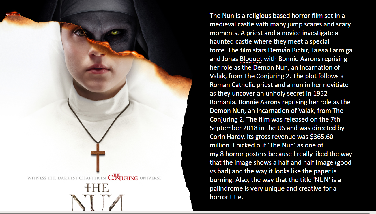
'The Nun' was one of my main inspirations for my poster because i really like the simplicity and uniqueness of its posters, the way that it is made of two images of her.
'Last Night In Soho' inspired me to create an image with two different images showing
The title placement and font of 'The Conjuring', has really inspired to create me a similar one. The advert will be flashing images of the monster I design chasing people, with screams, growls, and intense dramatic music in the background.

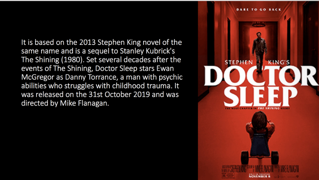
These are also various posters that inspired me when I began to create my posters.
Setting:
The images will be set in a scary/ gloomy/ dark setting, with a half and half image of a monster, and a blacked out edge.
The colour scheme will be dark gloomy colours, with the occasional bits of red in it to signify blood, and dark blue to portray a different version of the monster.
Font:
There will be a drippy/ skinny serif font for the title so that i can then use the liquefy tool to create a blood like font.
Target Audience:
MY target audience will be 18+ year old males as the majority of horror film viewers are this age.
Imagery:
I will use an image of the a monster, in one colour and then i will a split down the middle of the image and add a scary facial expression of the same monster on the other side in a different colour. The posters etc will be in a black, blue, white and red colour scheme.
The main character will be in the centre, and it will be a mix of two different images of him put together. These will be put up in DVD shops, on buses and on billboards in populated areas. The reason for choosing these locations is so that I can advertise the film in many different places, where all different types of people will see it.
Media products and software I will be using to create my Outcomes:
I will be creating Audio Visuals (due to the fact that 70% of the target audience are mainly influenced by this), Posters (A3 or A4), bus livery, bus stops, Twitter, Instagram and Facebook pages (1200x628 pixels) and billboards (6.096m x 3.048m) to help promote the film.
The idea behind this advertisement is to create interest in my product, and I hope that I can gain a minor following through teaser ad’s before the film airs. This will be done by revealing as little about the film as possible in the advertising but making sure that everybody will know when it will be arriving.
I will do this by creating thumbnail sketches, to plan my design and I will take it into Photoshop, In Design and other online editing websites to help give it a professional look.
The posters will be put up in DVD shops, on buses and on billboards in populated areas. The reason for choosing these locations is so that I can advertise the film in many different places, where all different types of people will see it.
P3: Create a plan for a cross media advertising campaign in response to a client brief
Pre-Production:
As part of my pre-production, I went into Photoshop and In Design and used played around with a variety of different techniques to help improve my skills.
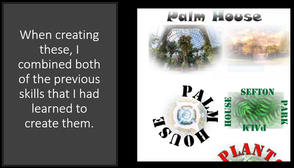
In Photoshop I had to use a special tool called FX to change the design, shape, colour and fonts of our text. This is just a practice of it as I had only just learned how to do it.
Typography:
I chose to keep to the dark red, blue and black tones to keep my horror posters, as they create a sense of fear. However I used white to highlight different areas of my poster.
Different websites and apps I used:
These are some of the main websites I used to create my poster, and to help picture them used in real life situations, in places such as busy city centres and public transport.
When I began to come up with ideas for my posters etc. I took various different images of graveyards, famous buildings and images of myself and other people using snapchat filters. These helped me to come up with a variety of different ideas and outcomes for my final design. I made sure that the majority of the images where completely different from the rest, so that when it come to my designing my final outcome, I had more of a variety of options that I could create.
Personal Images:

After that, I started to narrow it down and pick a few of the images to start and create different designs and images. I chose the scariest and most intriguing images that I had taken. I used different filters on Photoshop, and played around with the different tools, to see what worked.
Favourite images:
When creating poster designs, I didn't want to limit myself to just one style, so I decided to pick a few of them and do some trial and error to see what worked best. Once I played around with a variety of different filters and tools, I quickly decided that a darker colour theme would best suit my horror theme as it gave a more scary/ creepy vibe to it as you can see below.

M2: Justify the choice of planned components by targeted media sector
Layout: I have decided to place the image of my monster in the very centre of the page. The monster is arguably more important that the title, as it is what will draw the viewers attention to the poster. I will then place the title at the very top of the page, right above the monsters head.
Colour scheme: I have decided upon blues, reds and blacks with an outline of white. This creates a stark level of contrast whilst still being visually appealing, something that was demonstrated to me poorly by my research into already established ad campaigns. The use of the reds, help to create a sense of gore as it can be seen as a reference to blood. The blues create a cold feeling whilst making it look like it has a sickly blue digital glow.
Imagery: The monster will be in the very centre of the poster, and will be split down the middle. On one side of the image, there will be the monster in a blue, black and white variant, and on the other side it will be a simple black and white variant of it. There will also be a shadow of a hand holding a knife above his head and around the edges of the poster, there will be a black shadow.
Font: The font is often overlooked by many people, but your brain does process font and typeface more so than the words the font is being used to write. With the knowledge in mind that font can make or break a product I chose a a drippy/ skinny serif font for the title so that i can then use the liquefy tool to create a blood like font. I will copy and paste two of the same title and overlap them in two different shades of either red or blue.
Tone: I have touched upon this before I wanted to create an unsettling look with a distorted picture of the protagonist, making it unable to be read what exactly he is thinking.
LO3 Be able to produce the planned media components
P4: Create the media components to be used in the planned campaign
Production process:
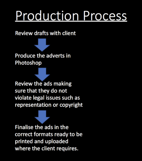
Before I began to come up with my final outcome, I decided to create a few poster plans all from images of my own, or from google, which I have modified. I began by picking out my favourite images, and began to test out different filters on all them to see what I liked.
For this poster, I chose one of my personal images to create this image, and put it into Photoshop and put a filter over it. The way the filter gives this poster a sort of old horror film style look, really intrigued me as it makes it look more dramatic and horrifying.
For this poster, I got one of my friends to lie on the floor to imply that there is a dead body there. The use of the plastic type filter over it, helped reinforce the idea of the title of it being "The Other Side". When creating the title for this poster, I chose a serif font, so that it looked like more of a classic film, and then I copy and pasted it and used the magic wand tool to change the colour of one of them. I then slightly adjusted the front one so that it had a kind of 3D style looked to it, which I think draws the reader in more.
I took an image of the medusa styled woman from google, and used the stamp tool to blend the scales into her face and darkened the edges of the snakes more. When designing the title, I chose a skinny/ slanted font and used the liquefy tool to create the ridged effect, which personally, I believe fits in with the whole concepts of snakes.
As I created this poster, I decided to keep the colour scheme across the image and the title the same, as I faded the title from dark to light blue. Also, the use of the skeleton "inside" of the human head really stood out to me as it is a reference to the dead and the living.
For this poster, I modified one of my other designs, and inverted the colours, so that it was more bright than dark. After viewing both of the posters, I decided that the darker one fitted in more with the assignment brief as it looked like more of a horror poster.
After various different designs and outcomes, I finally chose an image that worked best for me as it suited the style and theme I wanted.